
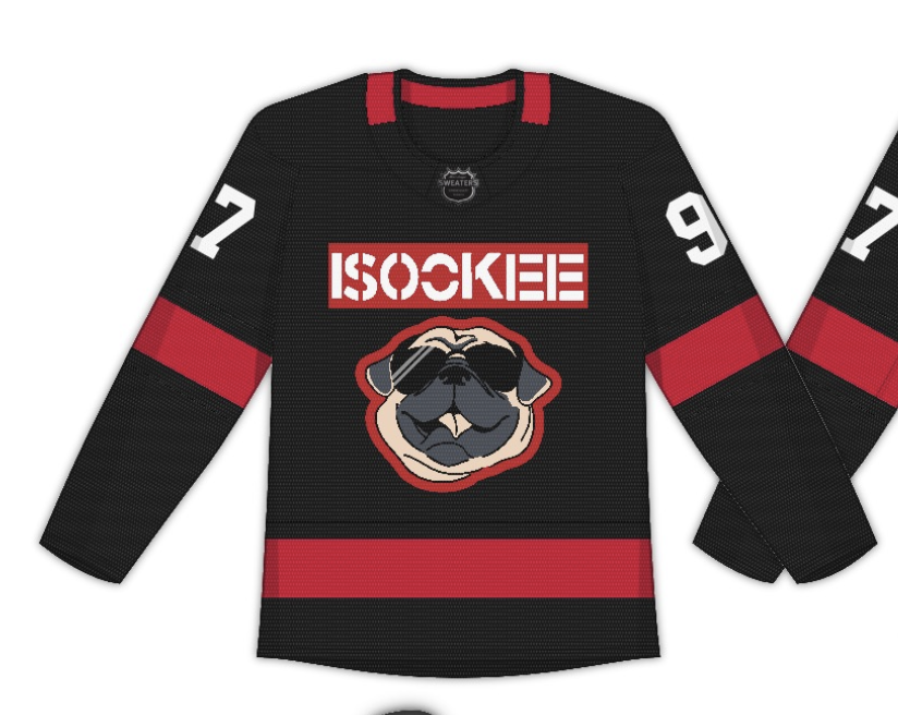
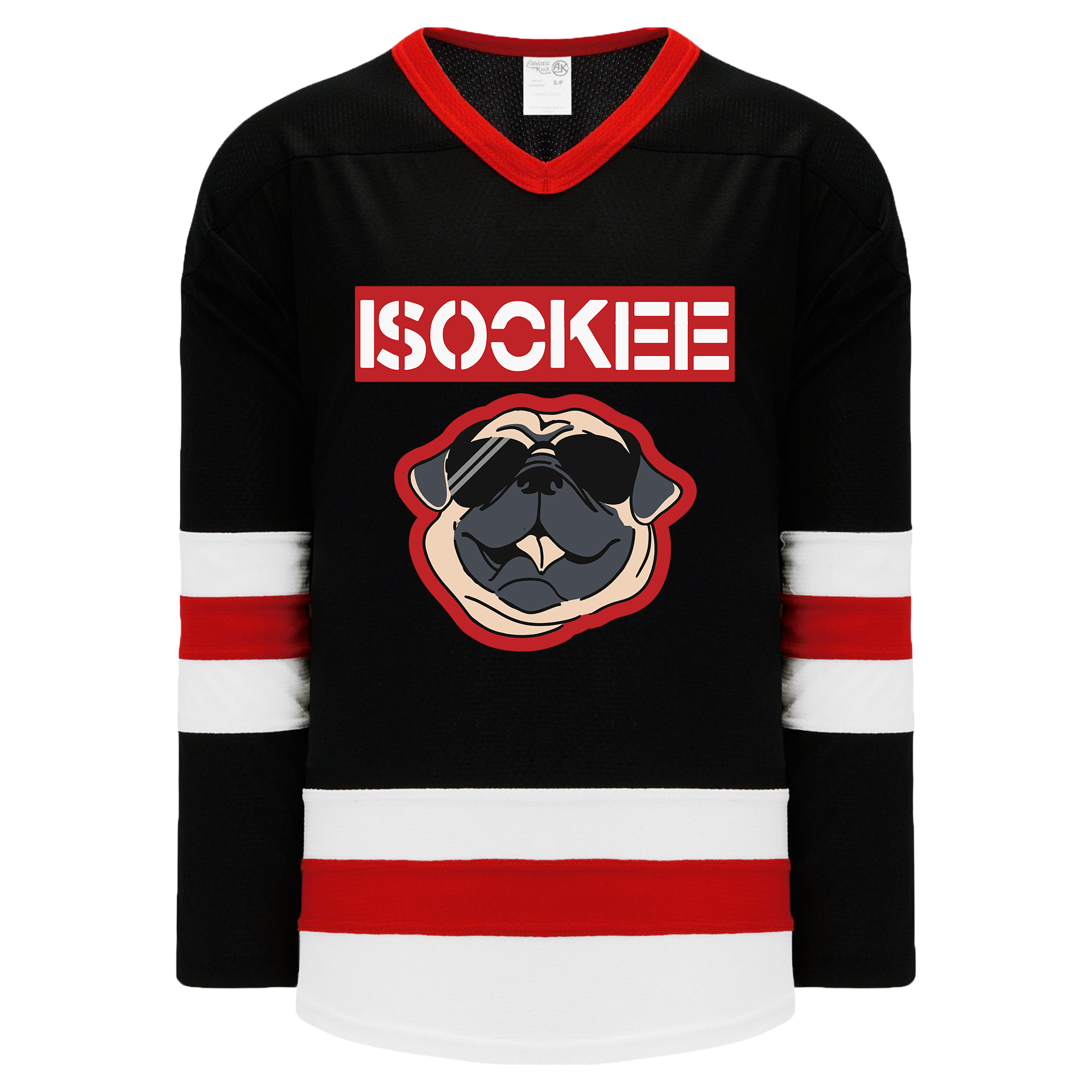
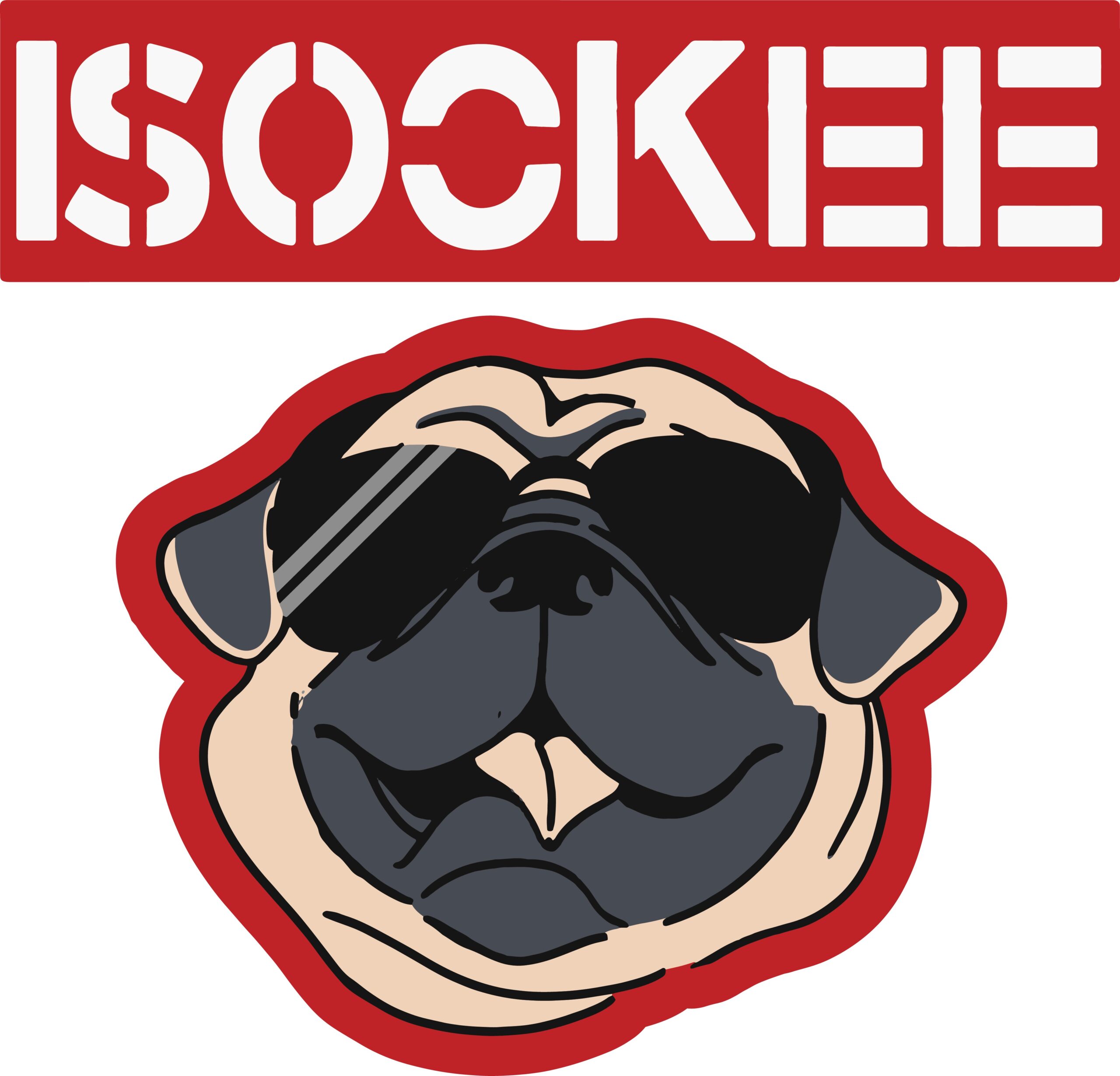
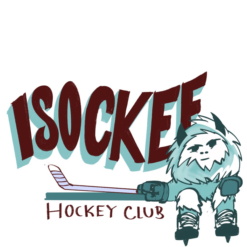
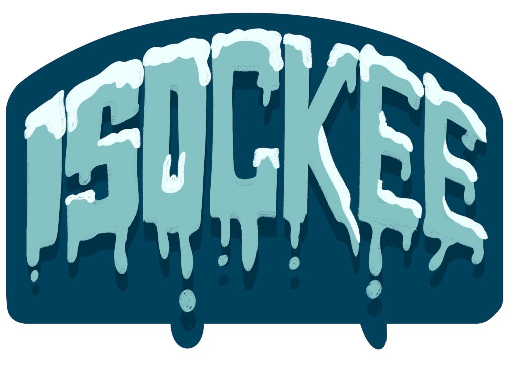
A local youth hockey team needed a tournament gift bag design that felt true to their identity, but there was a catch. They play out of UConn and share a similar name, but couldn’t use any of UConn’s official branding or imagery. The challenge was to create something that captured the team’s energy and pride without crossing any trademark lines. I started sketching in Procreate, exploring ideas that leaned into a simple and retro style eventually landing on a custom mascot that felt fierce, fun, and entirely original. From there, I built out a custom type treatment in Illustrator to match, making sure the whole design felt cohesive and tournament-ready.
I leaned heavily into strong shapes and confident line work, using contrast and movement to give the mascot a real presence, something the kids would actually want to wear. I kept the color palette simple and high-impact for screen printing, and I made sure the design held up at different scales and placements. The layout and proportion were tested with mockups to ensure the composition worked on both shirts and bag materials. Feedback from the team helped refine a few details, like eye expression and tail positioning, to make the mascot feel just right. Every line was intentional, and the final design not only met the creative brief but gave the team something that felt truly their own.