

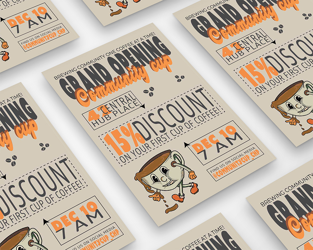
I used Adobe Illustrator to build the layout and dial in typography, while Photoshop helped with color tweaks and prepping final files for print. Everything was optimized, resolution, color mode, and file format, so the design was ready to go. I focused on bold color contrasts, clean hierarchy, and directional elements like arrows to guide the eye. A centered layout with boxed sections gave the whole design balance and unity, and I used consistent fonts and spacing to tie it all together. The typeface for the business name was playful but clean, matching the relaxed vibe of the brand. I started with sketches and layout trials to find the right visual flow, using only original or royalty-free assets with accessibility in mind.
The poster followed all the assignment specs, from layout size to resolution and required content. I did a little extra polish after the deadline to make it portfolio-ready, but the core concept stayed true to the brief. I shared and received feedback during critiques, which helped me refine the mockup presentation and really push clarity through hierarchy and contrast. Offering critique to others also helped sharpen my own thinking and justify my design choices. I paid close attention to the typography, kerning, weight, and structure, to keep it readable and strong. Everything was aligned to a clean grid with thoughtful white space, and the call-to-action stood out through smart contrast. Final files were clean, organized, and ready for print.