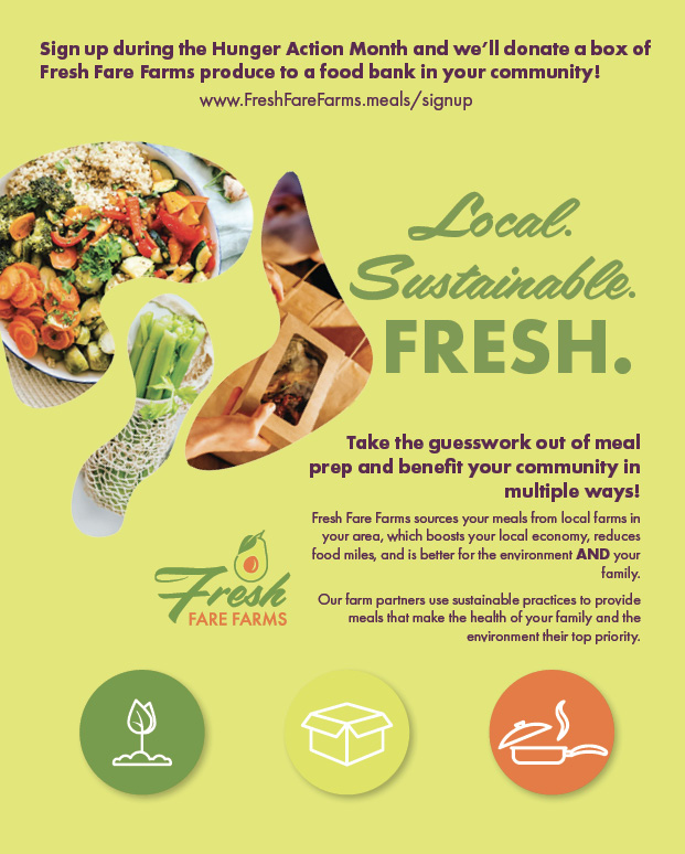
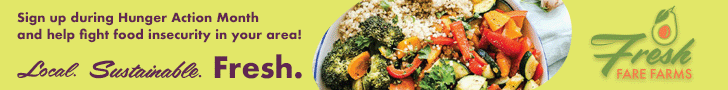
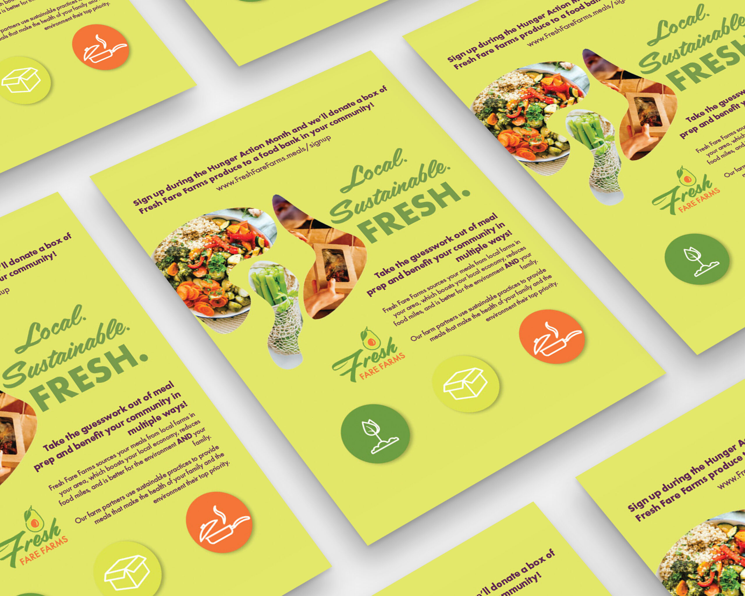
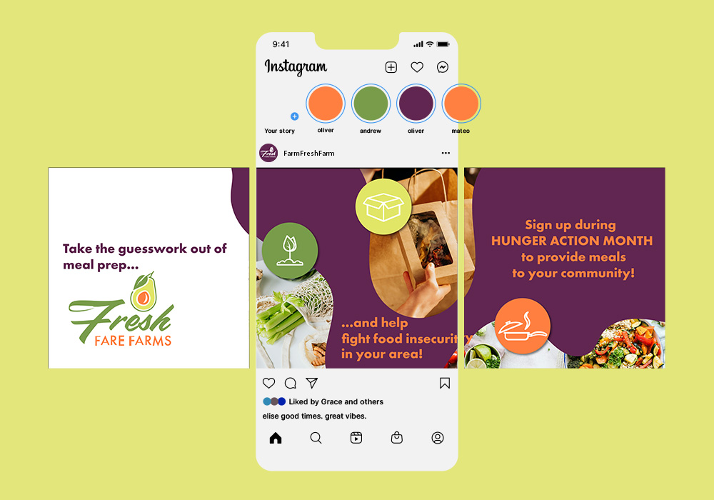
I used Illustrator to create clean brand shapes and align layouts, while Photoshop helped with image editing and building an animated GIF using the timeline tool. Every piece was properly sized, formatted, and color-adjusted to keep things consistent across formats. I stuck closely to the project brief, using the required fonts, color palette, and deliverables and made thoughtful adjustments based on critique, like improving the carousel’s call to action for better clarity. Sketching and thumb nailing early concepts helped guide the direction of the work, blending a bold, graphic style with elements that still felt true to the brand. I kept accessibility and ethical design in mind throughout.
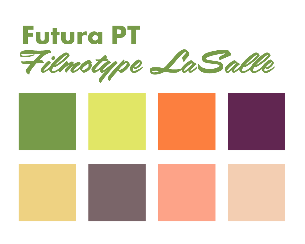
For the visuals, I chose a dark purple and green color palette to create contrast and brand alignment, pairing organic and geometric shapes to keep the layouts clean but engaging. Hierarchy, white space, and alignment guided the structure, while repetition helped tie the campaign together across different pieces. I used branded shapes to frame important info, which added originality and helped unify the look. Grid systems ensured alignment and balance, and I double-checked every detail, contrast, type hierarchy, spacing, resolution, and file sizes, to make sure everything was polished and ready for print or screen. The final result felt cohesive but flexible, with craftsmanship and intent behind every choice.