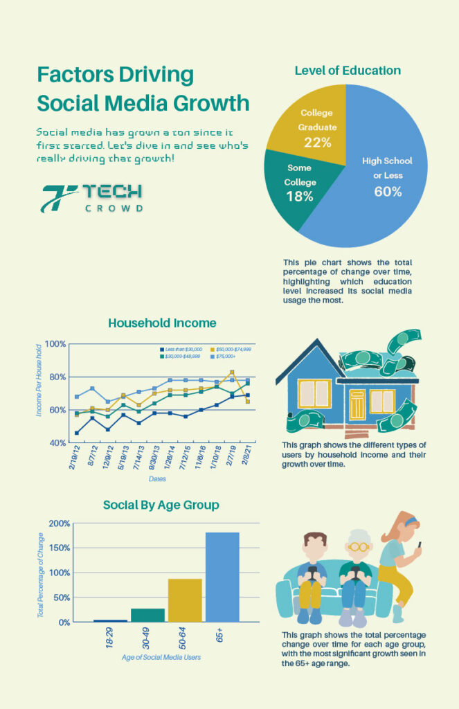
Infographics are one of my favorite ways to take boring, overwhelming data and turn it into something that’s actually fun to look at. For the “Factors Driving Social Media Growth” piece, the concept came from a mock tech magazine that wanted something bold, engaging, and easy on the eyes, without drowning readers in stats. They provided the color palette and general direction, and I took it from there. I created custom illustrations in Procreate that aligned with their branding but brought a playful energy to the layout. The graphs and supporting visuals were built in Illustrator to keep everything clean and scalable. I focused on hierarchy, white space, and flow, so the eye naturally moves through the data without feeling bogged down.
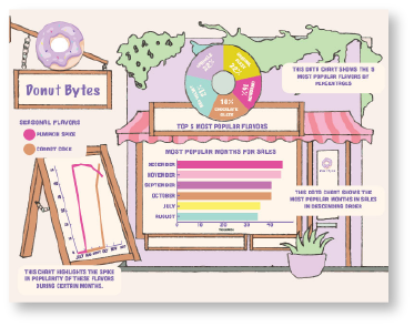
The second infographic was for a mock bakery brand tracking their donut sales across the year. I leaned into the charm of the topic by building an entire bakery scene in Procreate and tucked the graphs right into the illustration, like donuts in a display case. It was important that the data felt integrated, not just slapped on top. Illustrator helped refine the graphs for clarity and legibility while still keeping everything on-brand and cohesive. These projects pushed me to think about layout and communication differently. The visual hierarchy and rhythm were carefully considered, and I made sure every decision, from font choice to color contrast, served the content. It was also a great chance to put feedback into action, tweaking small things like bar thickness and illustration contrast to boost clarity without losing the fun.