
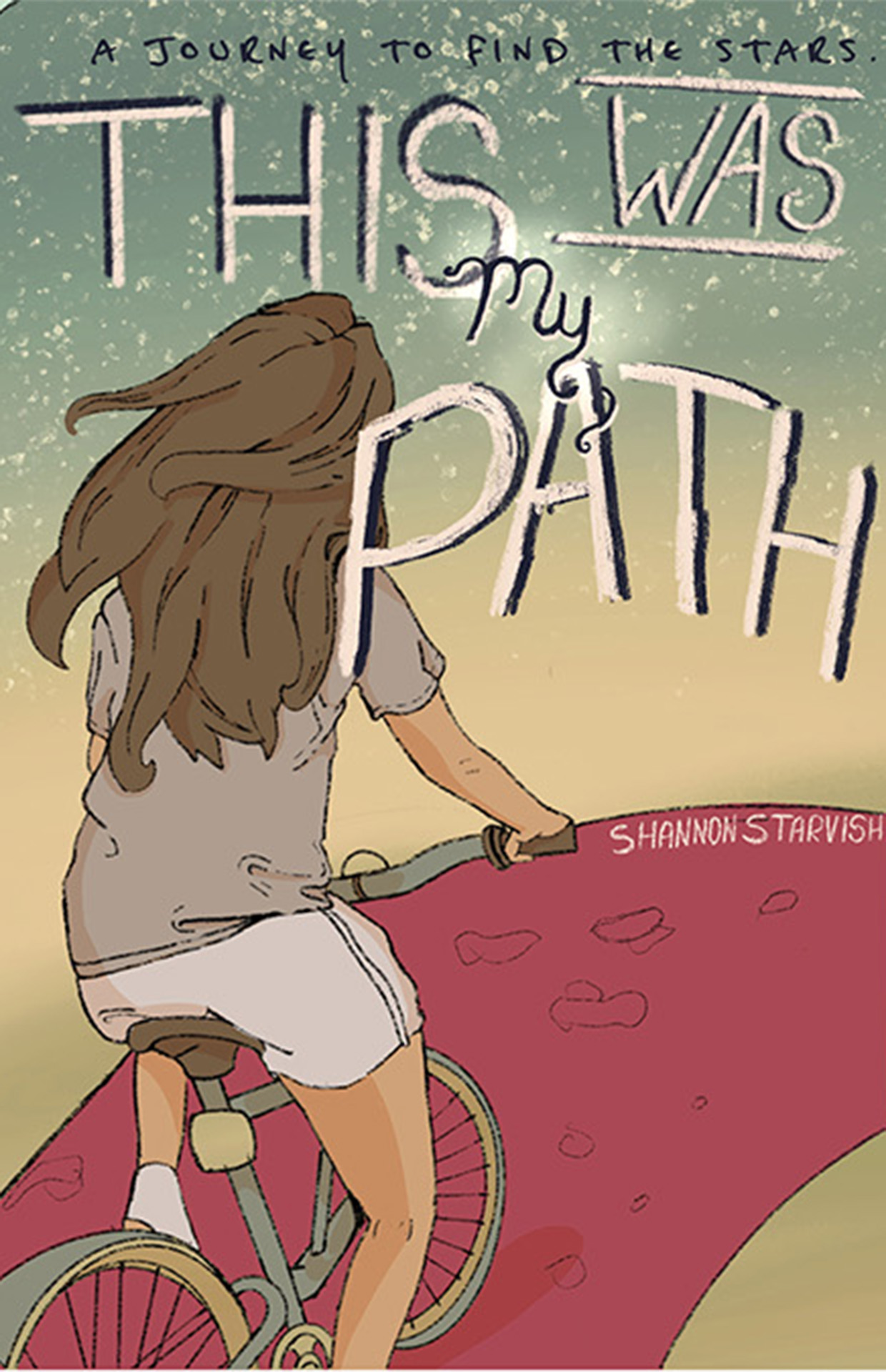
I used Procreate, Illustrator, and Photoshop to create and mock up the book cover, layering illustrations and type to keep everything clean and export ready. I tested fonts and effects to find a balance that felt playful but still professional. The bold, adventurous tone of the story helped guide my design decisions, I leaned into contrast and hierarchy by pairing bold fonts with lighter handwritten ones, creating rhythm and focus. I explored a few different type options before choosing the ones that felt most aligned with the story, and I intentionally used indie made fonts to match the hand drawn vibe. Everything was ethically sourced and layered with care, with consistent color and type styling throughout.
I followed the project brief while still leaving space to get creative, especially in the subtitle and font pairing. I created two mock-ups to explore different directions, then refined the stronger concept for my portfolio. I gave and received feedback on the mockup design, and used those critiques to fine tune spacing, scale, and visual weight. Every element, from layout to type to illustration, was placed with intention. The final files were clean, layered correctly, and ready for both print and screen use.