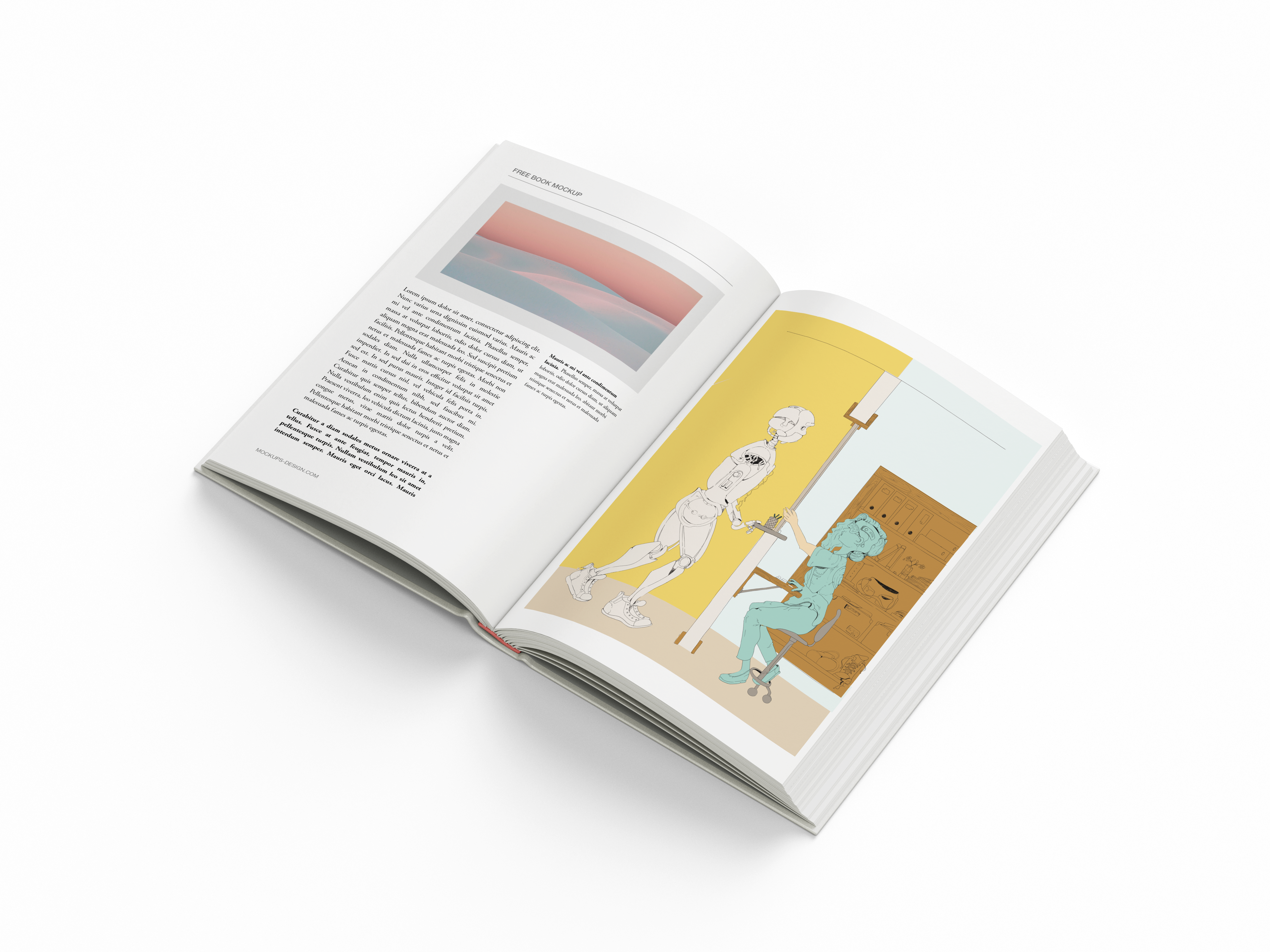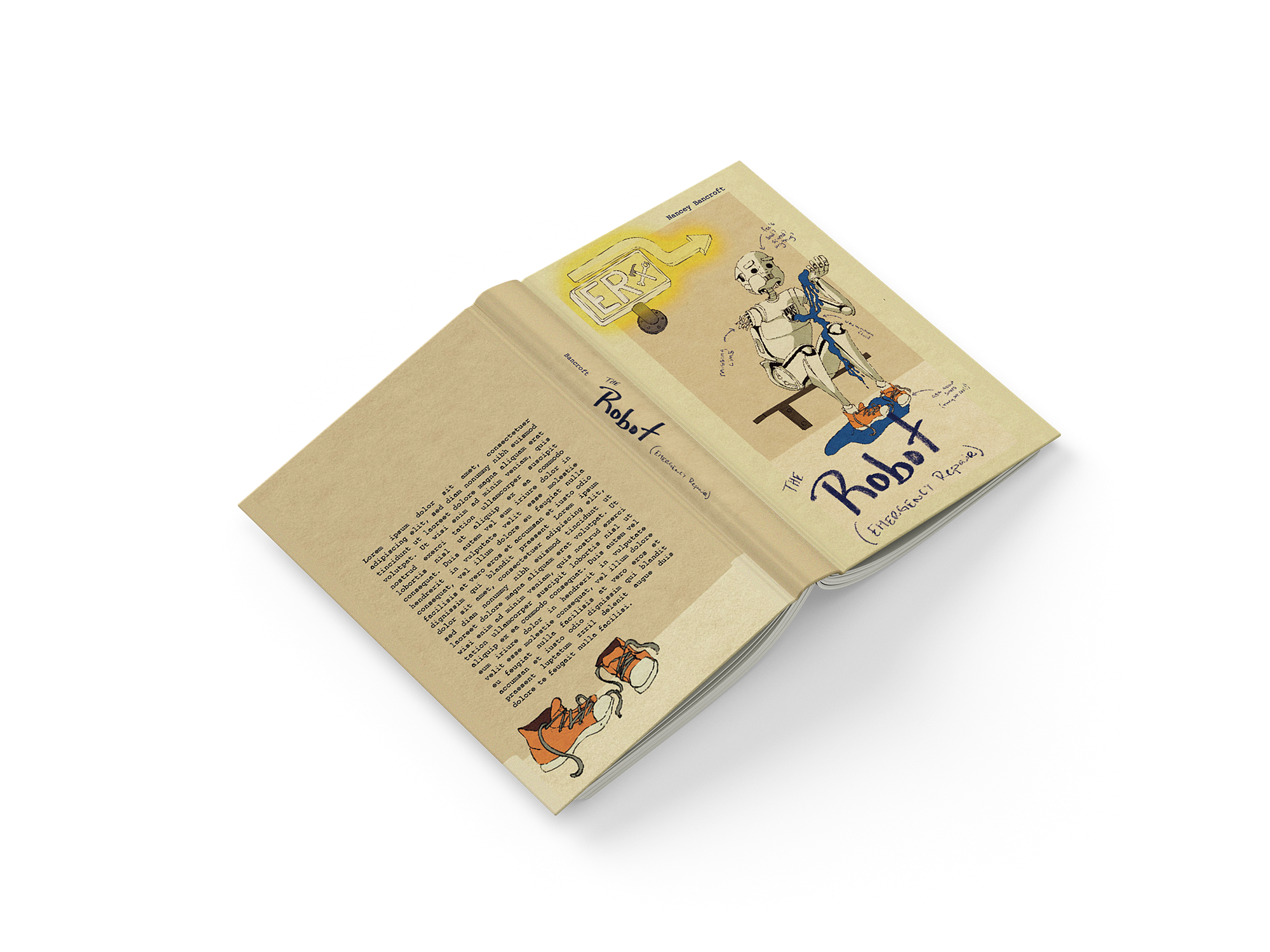
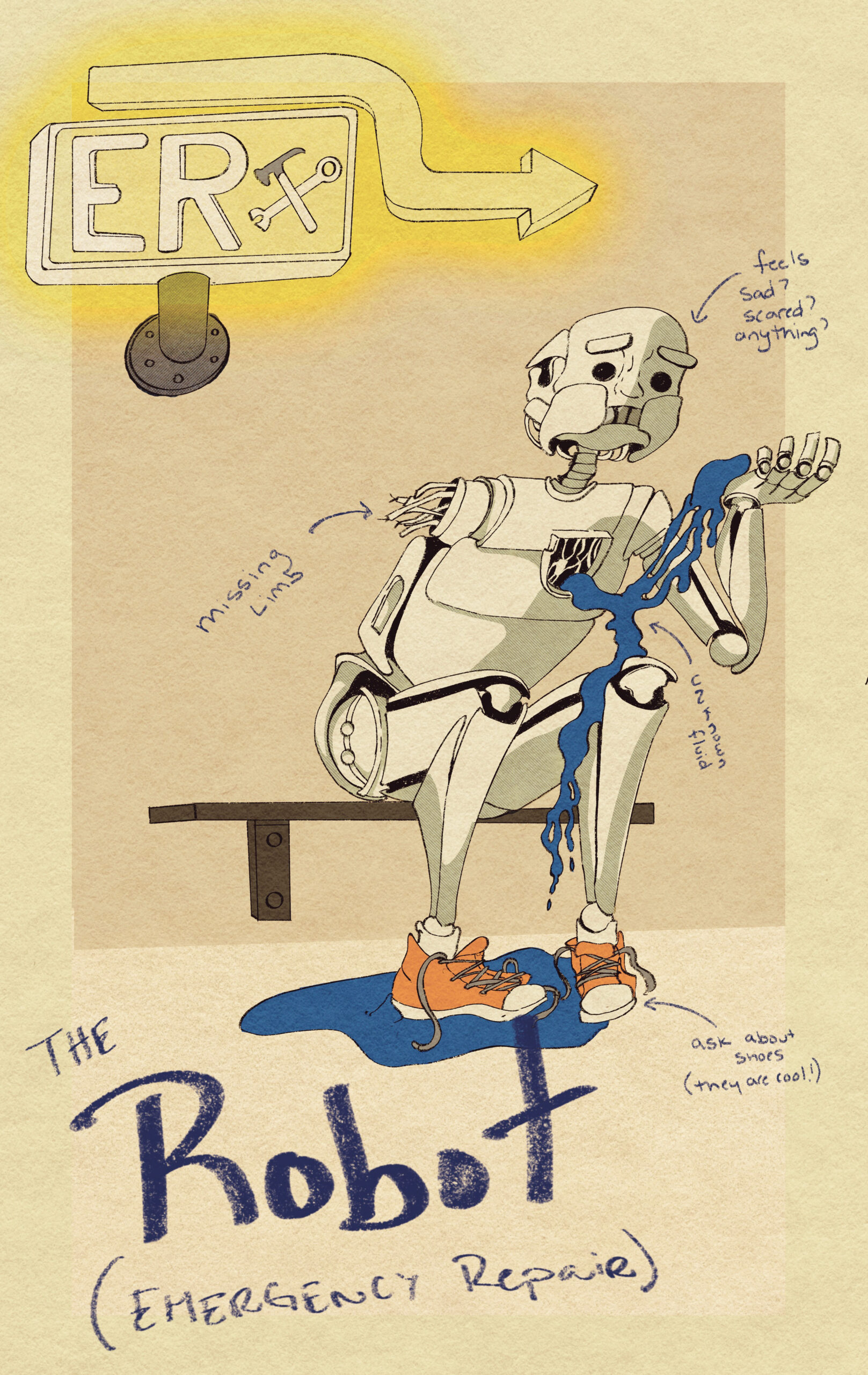
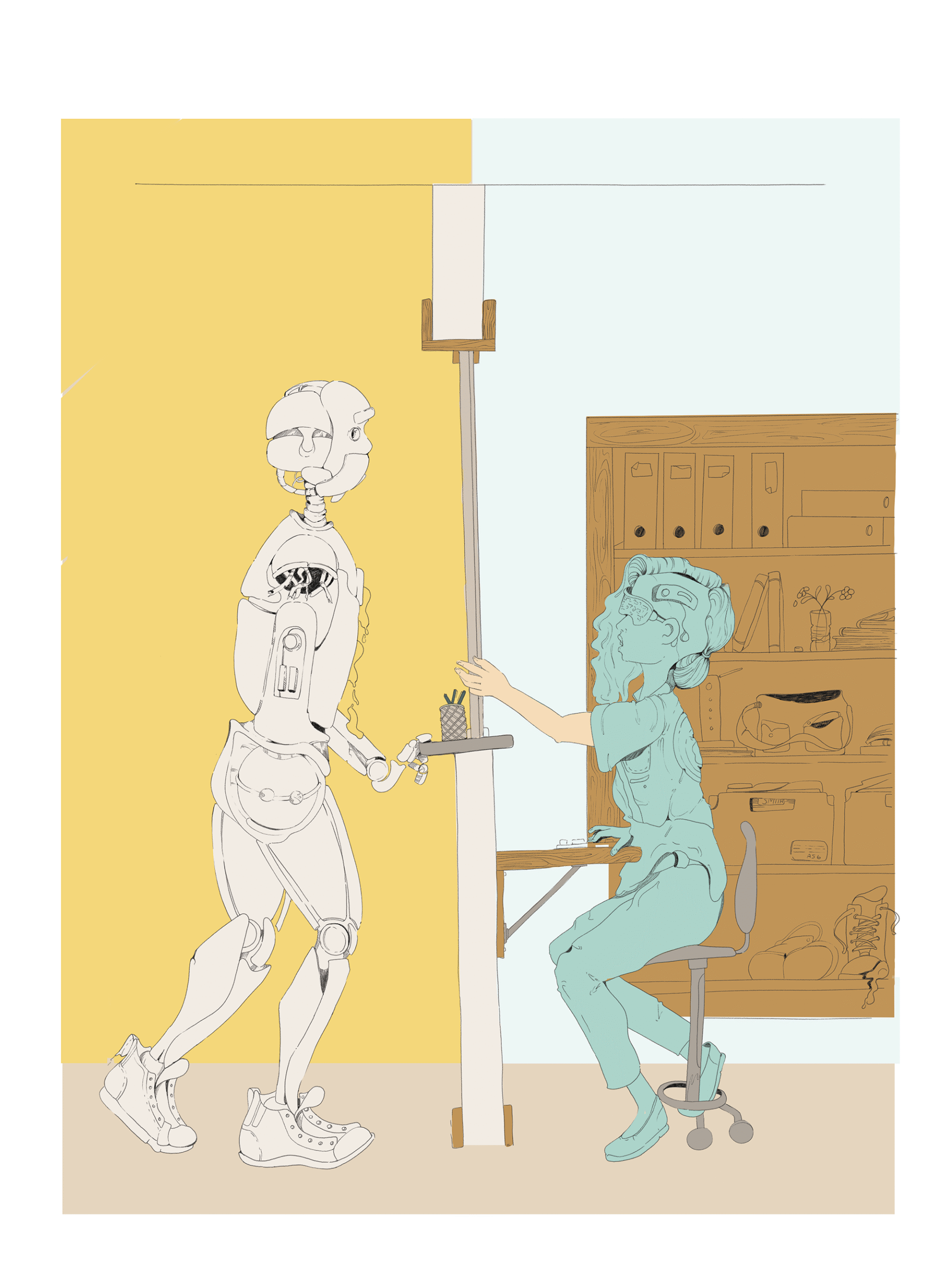
This book cover started as a sketchbook study on how the human body moves, but once I broke it down into simpler mechanical parts, the concept of a robot needing a doctor kind of wrote itself. What began as anatomy practice quickly turned into a mini narrative. It eventually evolved into a three-piece series: the cover design and two interior pages. I drew everything by hand with pen and paper, then cleaned up the illustrations in Photoshop. From there, I handled the layout in InDesign and used Illustrator to finesse the typography, each program played a role in shaping the final look and feel.
I was really focused on keeping the flow of movement clear, using line and contrast to create visual rhythm and guide the eye across the page. The color palette is limited but intentional, helping to emphasize key moments and maintain unity across the series. I played with white space to balance out the heavier line work and made sure all type was readable but still felt integrated into the artwork. I stuck to the assignment guidelines but made a few tweaks post-critique to help the pacing and layout feel stronger. Every piece of the project, from sketch to final export, was done with intention and care, and I’m proud of how it tells a story while still showing off my process.